Case study · Concept
Arcada Dental Studio
See exactly what you're getting.
Dental clinics in Mexico pay for every click from US and Canadian patients, then send those clicks to a generic homepage. Arcada is a fictional Tijuana clinic we built to show the fix: a premium 3D homepage that proves the craft, and a landing-page system that gives every ad its own page with the same headline, the same price and the same next step. Each page loads in about 100 KB.
- Project
- Arcada Dental Studio, a fictional dental implant clinic in Tijuana (studio concept)
- Scope
- Concept, brand and logo, art direction, 3D, ad creatives, landing-page system, front-end build
- Stack
- Astro 7, TypeScript, Three.js (homepage only), no UI framework
- Timeline
- October 2026, twelve design rounds
- Pages
- 3D homepage, two ad landing pages, ad → page showcase; English and Spanish
- Result
- Ad landing pages at ~100 KB on first load, with no 3D runtime
Context
Clinics that already pay for clicks
Thousands of US and Canadian patients cross into Mexico every year for dental implants, often after being quoted $20,000 or more at home. Clinics in border cities like Tijuana compete for them with Meta and Google ads aimed across the border.
These clinics already spend money on every visitor. That makes them an unusually good client for design: a better landing page doesn't have to be argued for on taste, because it shows up in the cost of each consult request.
Arcada (Spanish for the dental arch) is a fictional clinic we invented to show that offer end to end. Everything about it is labelled as a concept: the doctor, the prices, the reviews and the ads.
The problem
The ad makes a promise. The page forgets it.
Look up these clinics in the Meta Ad Library and follow their ads, and the pattern repeats. The ad promises something specific; the click lands somewhere general.
- Generic homepage. An ad for "full-arch implants in 2 trips" opens on a slider about whitening, veneers and the clinic's history.
- No price where the ad showed one. The number that earned the click is nowhere on the first screen.
- Spanish first for an English audience, or English that reads like a machine translation.
- Slow on a phone, where nearly all of these ads are seen.
- Five calls to action instead of one: WhatsApp, call, book, chat bubble, newsletter.
Underneath all of it is the patient's real fear: not knowing what they will get. Materials, hidden costs, what happens if something goes wrong. A generic homepage answers none of it.
The idea
See exactly what you're getting
Arcada answers the fear of the unknown with transparency you can rotate. The implant is in 3D, so you see every part before anyone touches you. The price is itemised in USD, line by line. The two trips are laid out on a timeline. And each ad lands on a page that repeats its promise word for word.
The project has two jobs. The homepage proves we can do premium. The landing-page system proves we can do it fast, for one exact ad, and it is the product we pitch: every prospect's ads are public, so the pitch can show their own ad beside a page built for it.
Light and clinically precise, unlike our dark, neon or earthy concepts: porcelain and bone surfaces, a deep blue-black ink, titanium grey for the metal, and one deep teal that always means "this is the next step."
-
--porcelain
#F6F5F2
Page background
-
--bone
#ECE8E1
Cards, raised surfaces
-
--ink
#16202A
Text, dark sections
-
--ink-soft
#5A6570
Secondary text, mono labels
-
--titanium
#A9B0B6
3D metal, dividers
-
--accent
#1F6F78
The one action, “you are here”
Titanium is decoration, never text. At 2.0:1 on porcelain it fails contrast, so it is kept for dividers and the 3D metal, and every technical label is set in soft ink instead.
- Display and body: Geist, large and tight for headlines, 17–18 px for reading.
- Labels: Geist Mono, like the engraving on a part: "Ti-6Al-4V POST", "ZIRCONIA CROWN".
Every colour and font comes from one theme file. Swap the file and the whole system, homepage, landing pages and ad mockups, takes on another clinic's brand.
Homepage
An implant built entirely in code
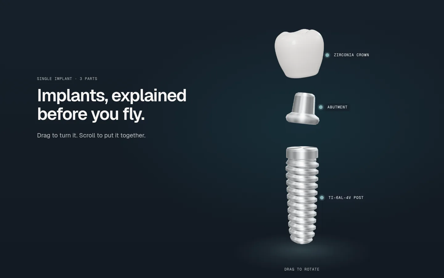
The plan was to model the parts in Blender and export a GLB. We built them in code instead. Every part is generated in TypeScript when the page loads, so there is no model file to download, and the stills, ads and fallbacks are rendered from the same scene the visitor scrolls.
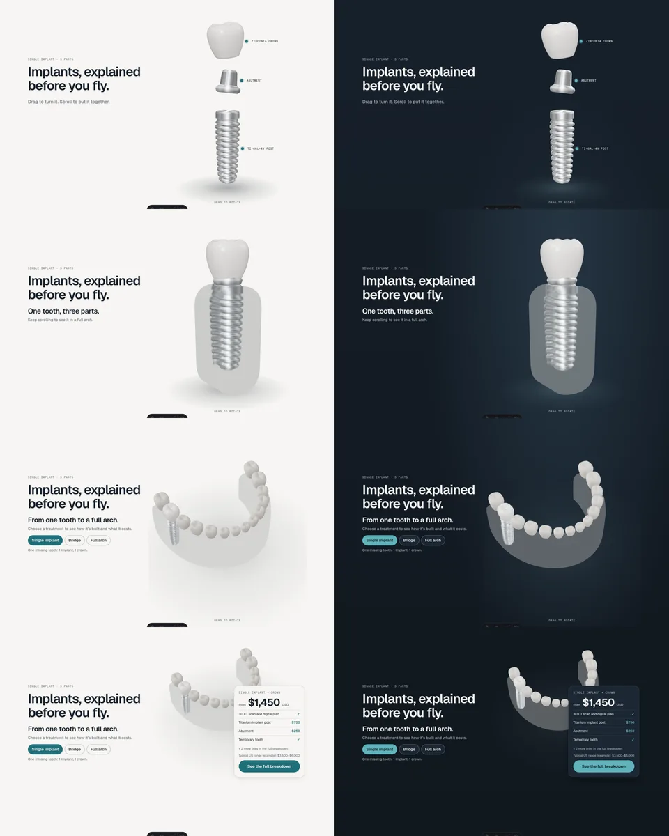
1 Three parts, apart
The hero opens on an exploded view: a titanium post with a true helical thread, a lathed abutment and a zirconia molar crown with cusps, turning slowly on a dark studio backdrop. Mono labels hang off each part, and each one opens a one-line explanation. Drag to rotate; the arrow keys do the same.
The thread is the detail that sells it. Its pitch is physically correct, so as the post descends it turns exactly one revolution per thread, the way a real implant is screwed in.
2 Scroll puts it together
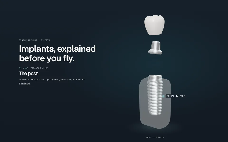
About three screens of scroll drive the assembly. A frosted-glass jaw rises in (no gums, nothing clinical), the post screws into it, then the abutment seats and the crown drops on. A caption beside it names each part's material and what it does.
3 From one tooth to a full arch
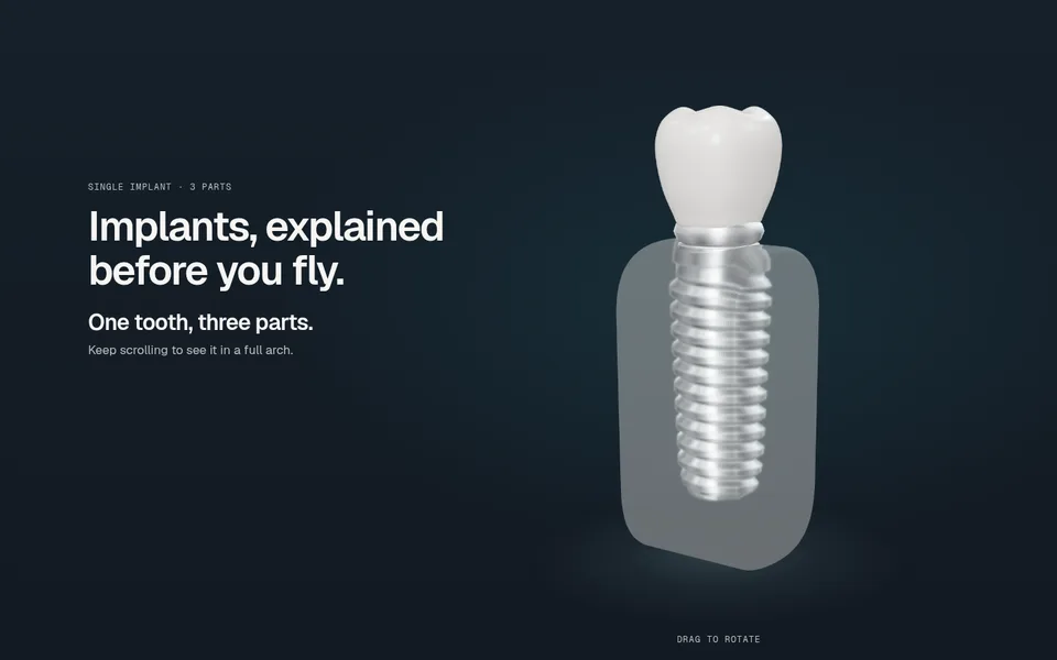
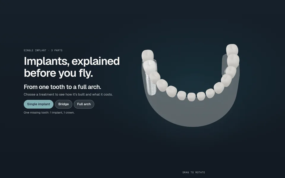
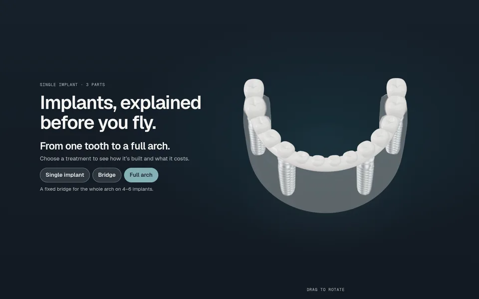
Keep scrolling and the camera pulls back. The implant becomes the first molar of a full lower arch, and the other 13 teeth ripple in around it. Three chips, real buttons, switch the model between the treatments the clinic sells: a single implant, a 3-tooth bridge on 2 implants, and a full-arch zirconia bridge on 4 implants.
4 The hand-off to the price
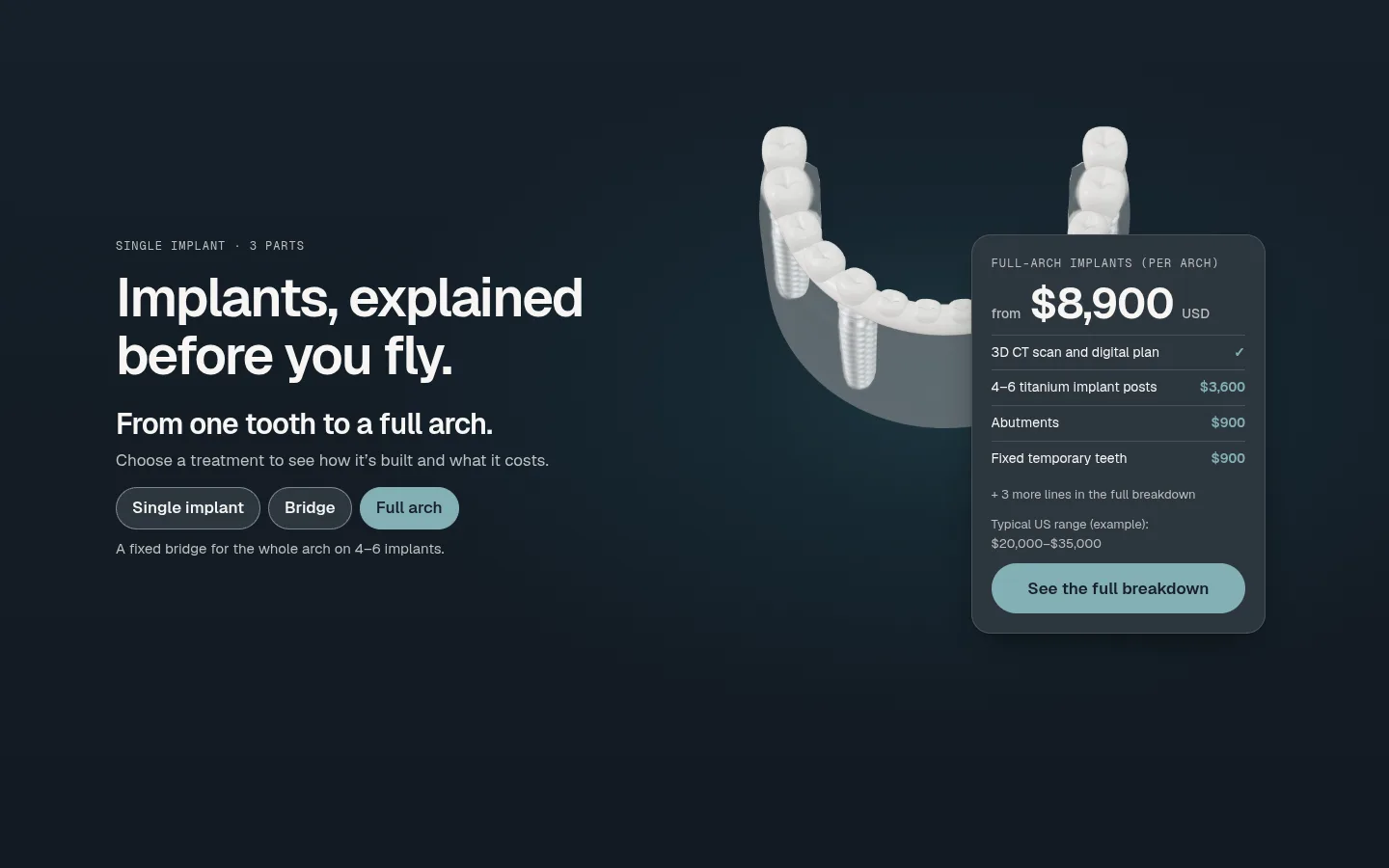
At the end of the scroll the model slides aside and the price card for the chosen treatment slides in: USD, itemised, "from." It is the same data as the price table further down the page, and choosing a chip in either place updates both. The 3D explains the product; then it gets out of the way of the number.
The hero went through its own rounds. The first versions were light, porcelain on porcelain, true to the palette. Side by side with a dark studio backdrop, the titanium and zirconia simply looked more like real materials, so the hero alone went dark, with a rim light and a soft floor glow, and the rest of the site stayed light.
Ad landing pages
The page says exactly what the ad promised
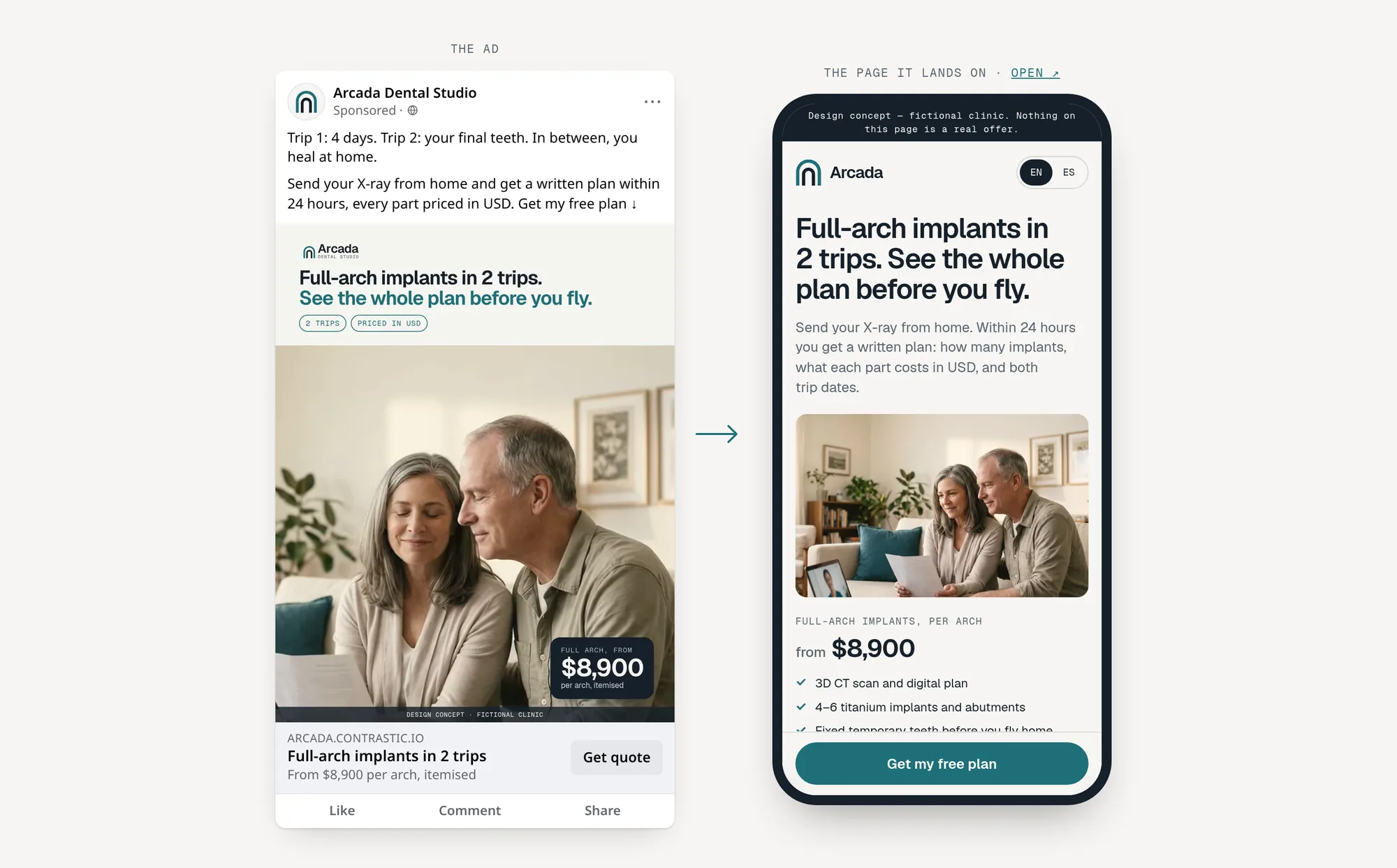
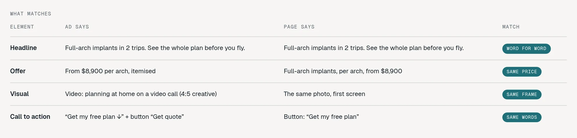
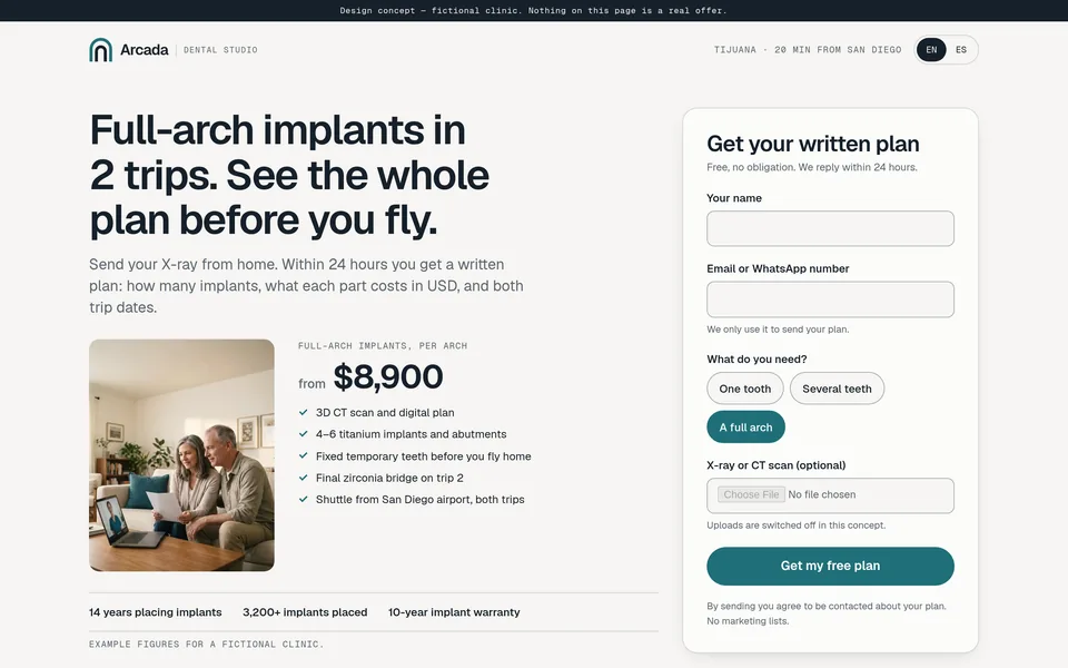
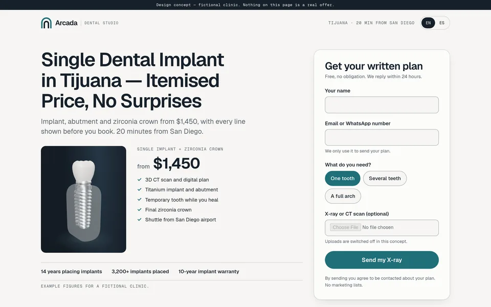
Each ad gets its own page, and its first screen repeats the ad: the same headline, the same visual, the same price and the same words on the button. There is no menu and one goal, a request for a free written plan.
We designed two demo campaigns, one per platform, with different angles.
A Meta: speed and clarity
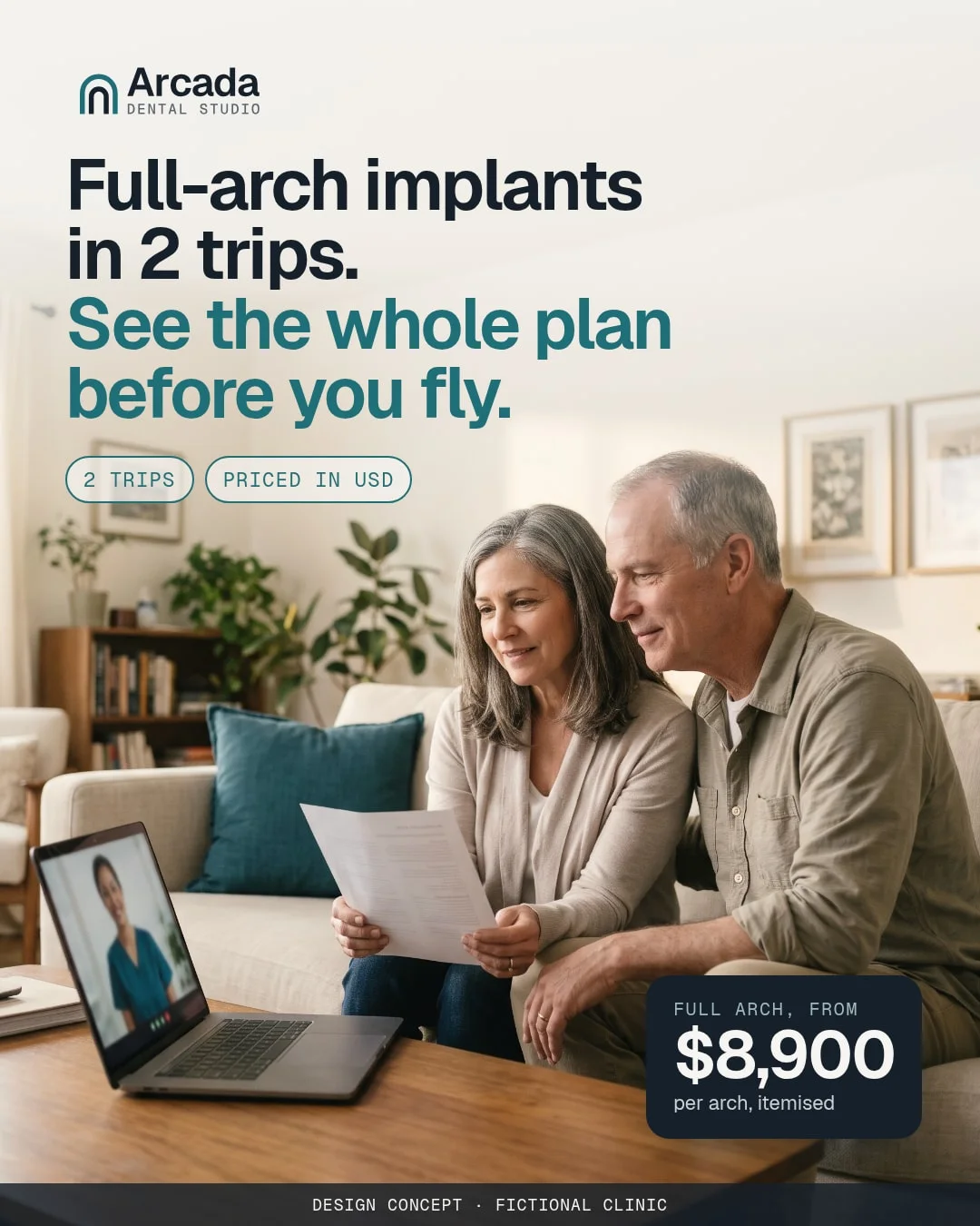
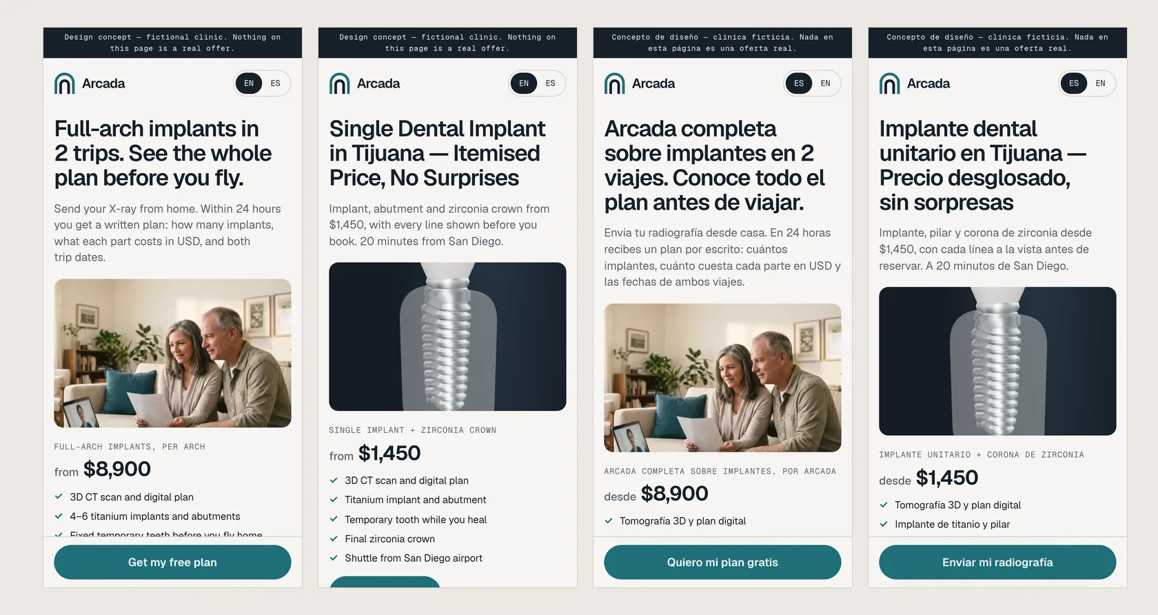
"Full-arch implants in 2 trips. See the whole plan before you fly." The Feed ad leads with the plan and the price, $8,900 per arch, never with how anyone's smile looks. The landing page uses the same photo without the text on top, the same headline word for word, and a button that says "Get my free plan."
B Google: price, itemised
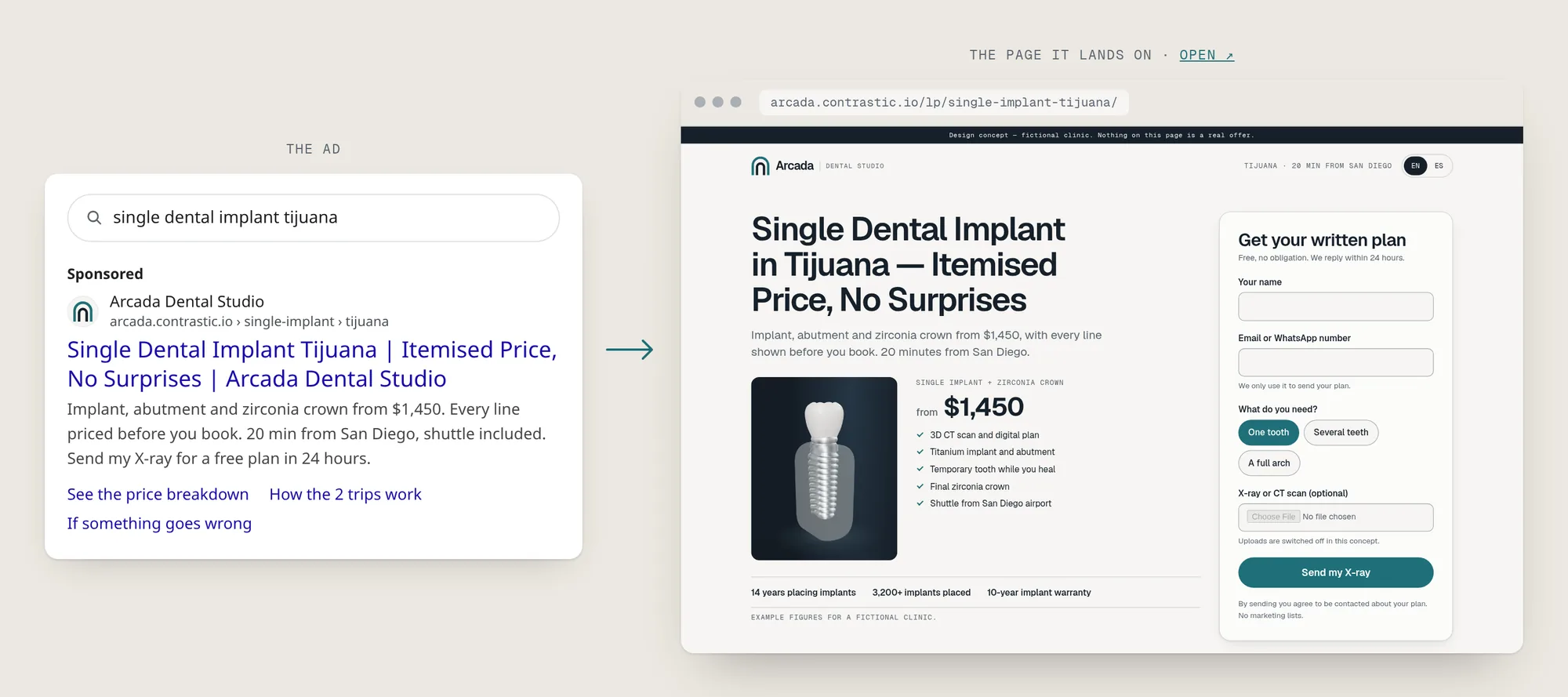
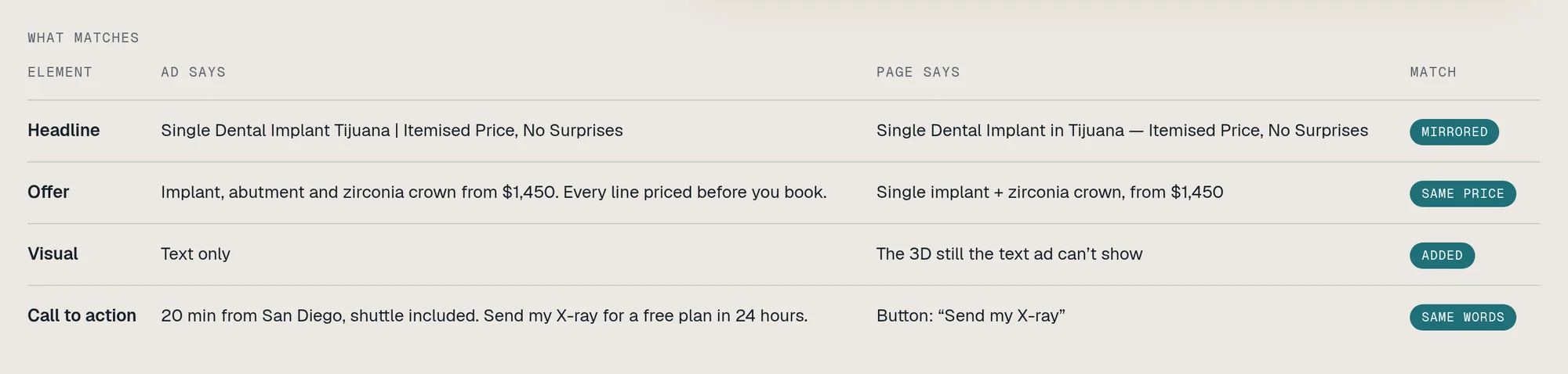
"Single Dental Implant in Tijuana — Itemised Price, No Surprises." A search ad is text only, so its page mirrors the main keyword in the headline and adds what the ad can't show: the 3D still of the implant, the $1,450 price broken into parts, and a form whose button says "Send my X-ray," as the ad did.
For ad groups with several keywords, a ?kw= parameter can swap the headline, but only to wording listed in the campaign entry, never to raw text from the URL.
C A new ad is a new entry, not a new page
Every landing page is built from one template and one content entry: the ad's headline, offer, price, visual, button words, trust facts and the FAQs picked for its angle (a price ad answers "what's included?", a fear ad answers "is it safe?"). Writing the entry is about an hour; Astro builds the page in English and Spanish.
That is how the pitch works. A prospect's ads are public in the Meta Ad Library and the Google Ads Transparency Center. We take one, build a private, noindexed page for it in their colours, and send three things: their ad, their current landing page, and the page we made.
Brand
One clinic, one look, everywhere
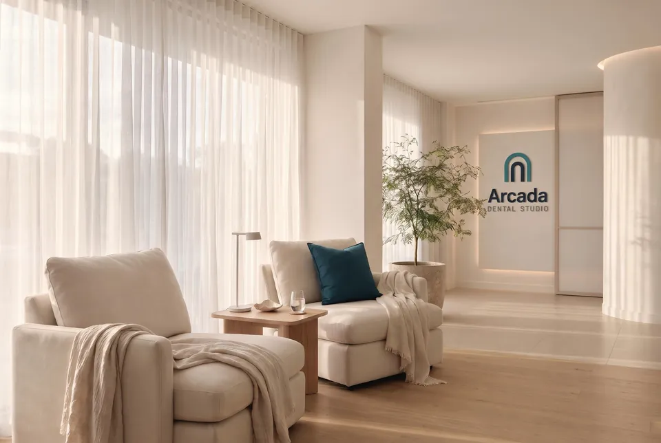
The mark is a double arch: a dental arch seen from above, and the arcade of a building. It works as a favicon, as embroidery on a coat and as a sign on the reception wall. The wordmark is outlined from Geist, with the descriptor in Geist Mono.
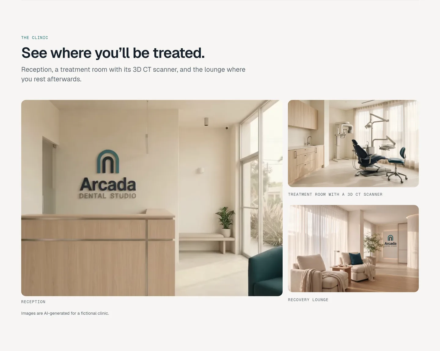
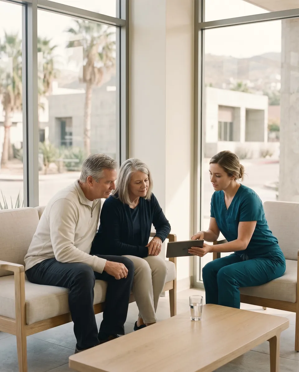
People and places are AI-generated from one brief: soft daylight, porcelain and bone, titanium grey, a single teal accent, no teeth or open mouths, nothing that looks like a result. The images were graded as one set. AI garbles lettering, so the logo was never generated: it was composited afterwards onto the reception wall, the lounge panel and the doctor's coat.

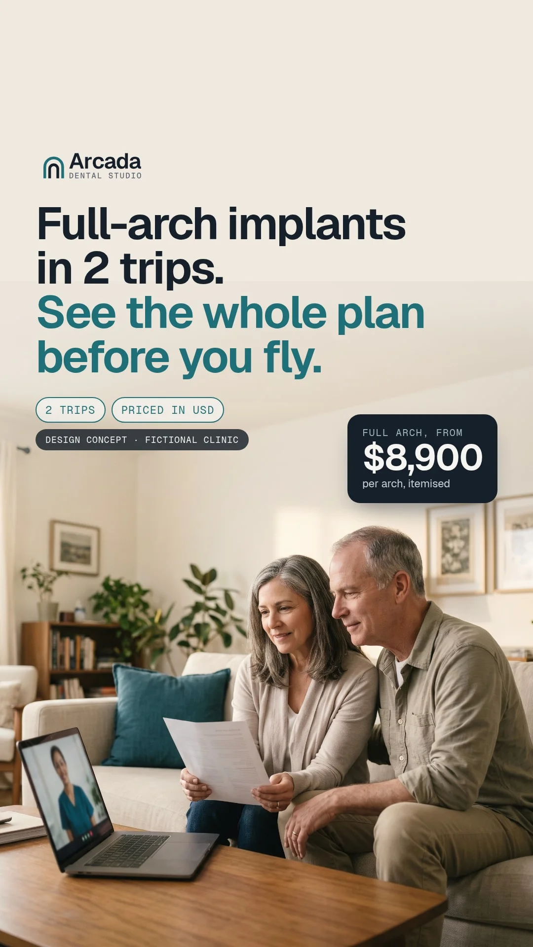
The ads come from the same set. The Meta creative is laid out in HTML, logo, headline, "2 trips" and "Priced in USD" chips, a price tag, and rendered by a headless browser to 1080×1350 for Feed and 1080×1920 for Stories, with the text kept out of the zones the Stories interface covers. A video version crops a generated clip of the couple into the same layout.
Homepage sections
Every worry gets a section
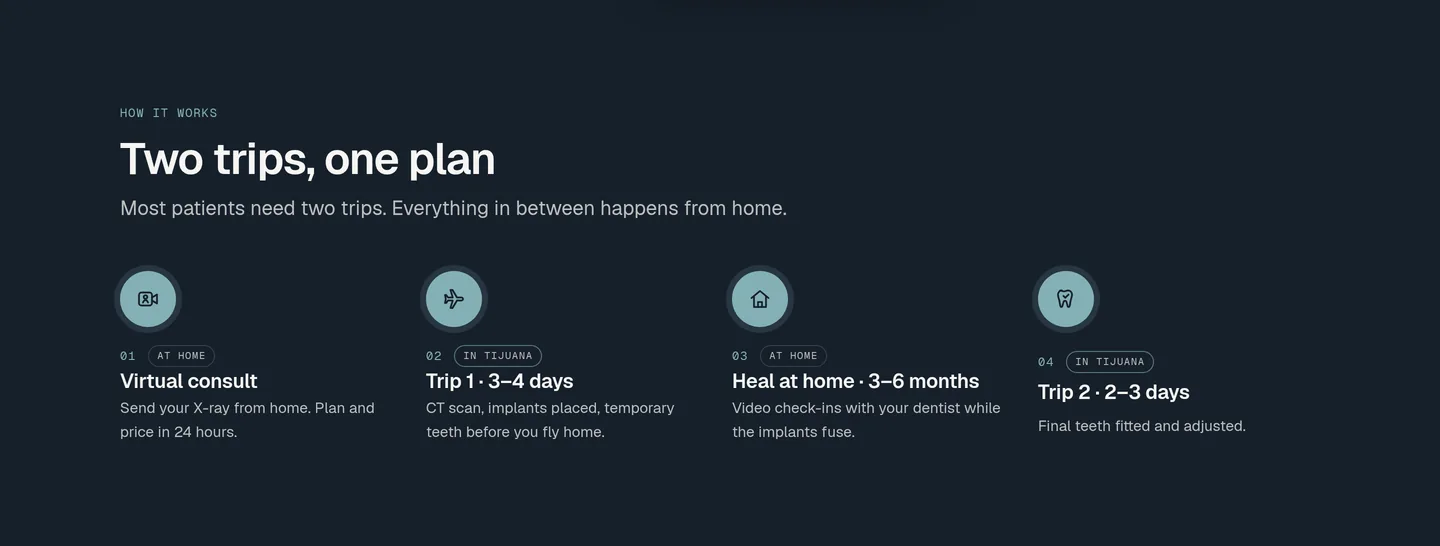
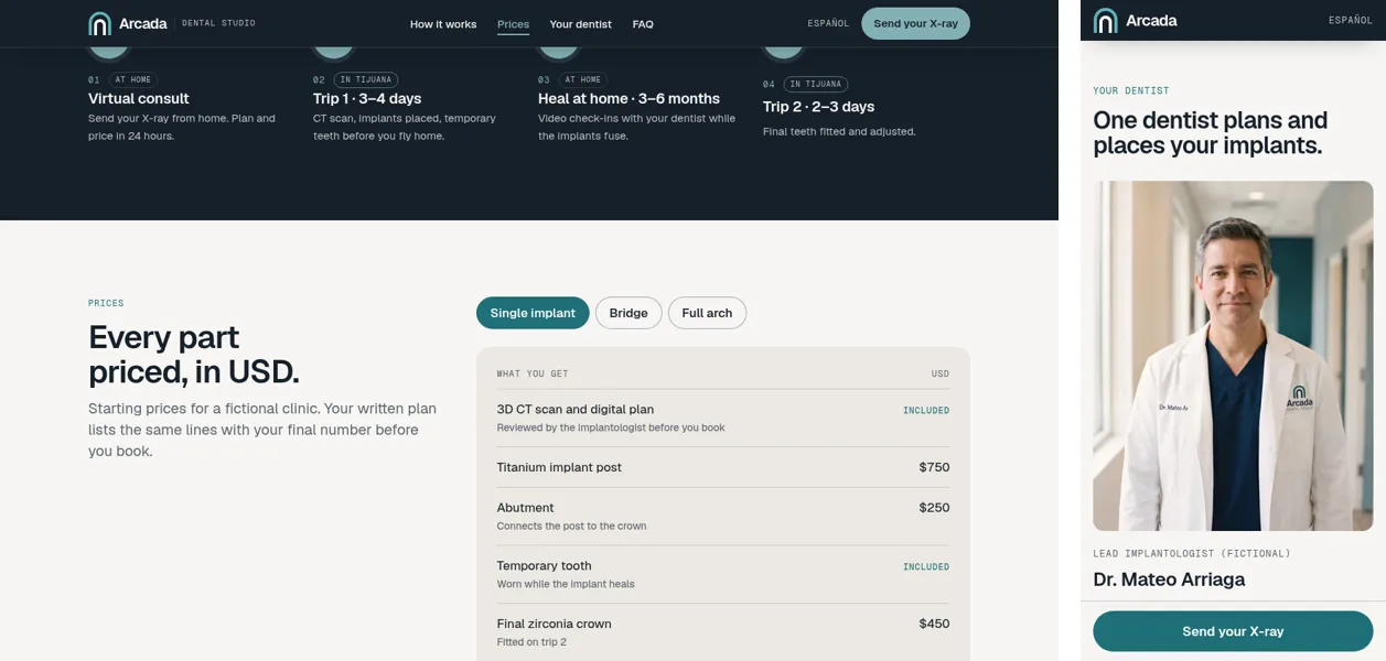
Two trips, one plan. A line draws through the journey as you scroll: virtual consult, trip 1 (implants placed), 3–6 months healing at home, trip 2 (final teeth). Each stop lights up, and a small plane rides the tip of the line and turns around for the flight home.
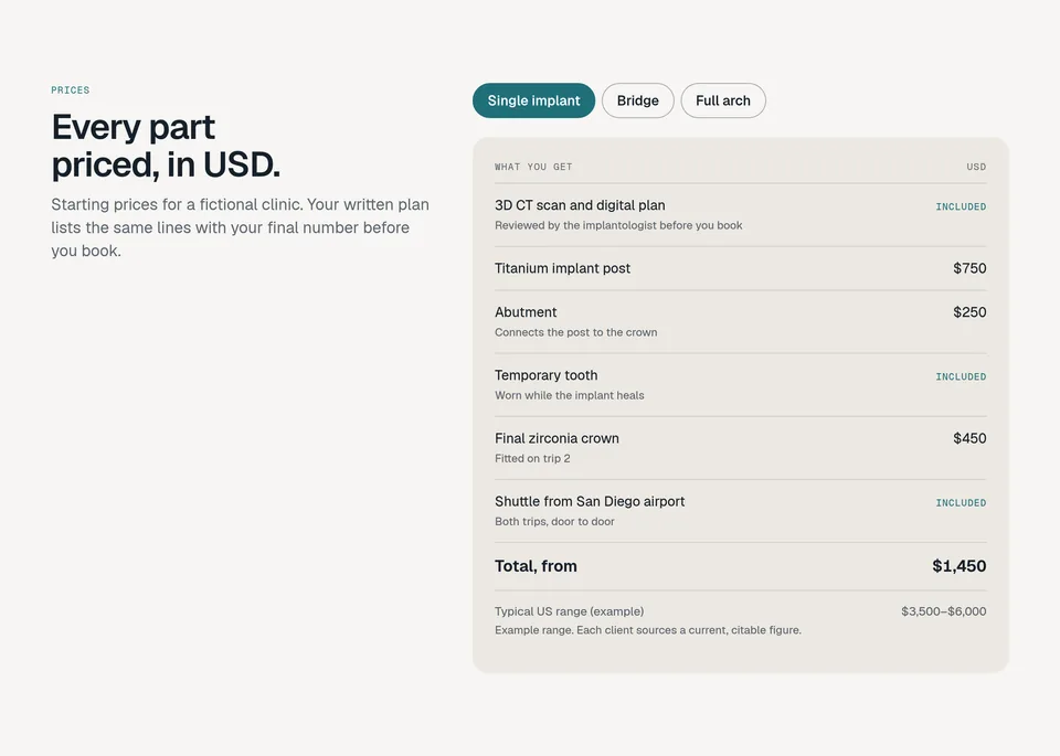
Every part priced, in USD. One table per treatment, with every line a patient might worry about: CT scan, implant, abutment, temporary tooth, final crown, shuttle from San Diego airport. A "typical US range" sits under the total, labelled as an example, because a real clinic has to source that number.
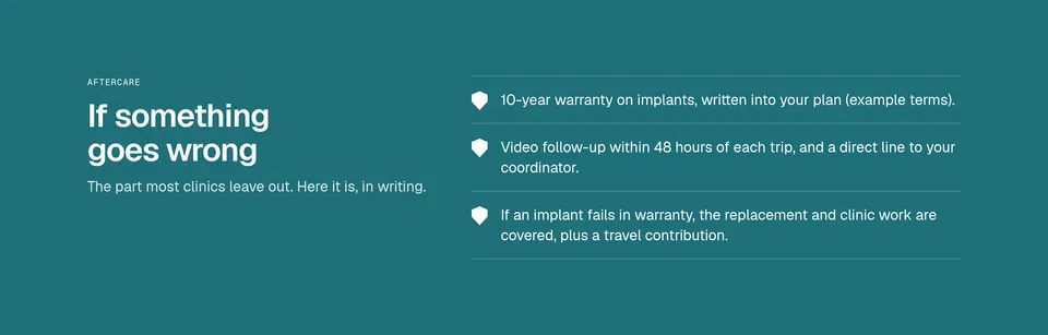
If something goes wrong. The trust section most clinics leave out: the warranty in writing, video follow-ups after each trip, and what the clinic covers if an implant fails, including a contribution to travel.
English and Spanish
English first, Spanish beside it
The patients who click these ads read English, so English is the default, written for them: plain prices in USD, short sentences, no clinic jargon. Every page has a Spanish mirror under /es/, written rather than machine-translated, for Spanish-speaking patients in the US and for the clinic's own staff.
Campaigns, treatments, FAQs and the doctor carry their own Spanish fields, so a new ad comes with both pages. Switching language on a landing page keeps the UTM parameters and click IDs, so the clinic still knows which ad the lead came from.
Compliance
Built to pass review in both countries
Health advertising is regulated on both sides of the border, and an ad that gets rejected or a page that gets a clinic fined is worse than no page. So the rules shaped the design from the start, and the concept models them. (This is design practice, not legal advice: each client confirms with their own counsel.)
- COFEPRIS (Mexico). Promoting a health service, even on the clinic's own site, needs an advertising notice or permit. Every footer has a placement for the notice number, and credentials appear as "Cédula 0000000 (example)", where a real clinic shows its real cédula.
- No before/after, no patient photos. Mexico treats them as regulated advertising, and they are the first thing ad reviewers flag. The 3D model and the illustrations carry the visuals instead.
- Meta's health policy. Ads target 18+ and never make people feel bad about how they look. No "embarrassed by your smile?": the ads lead with the plan and the price.
- Sample testimonials, labelled. Reviews on the homepage and landing pages are marked as samples for a fictional clinic; a live clinic shows verified patient reviews there.
- Honest numbers. The "typical US range" next to each price is labelled as an example, since savings claims need a real, current source per client. No implant brand names and no trademarked treatment names: "full-arch implants" says it plainly.
- Visibly a concept. Every page is noindexed and carries a concept banner. The phone number is a dummy, the forms send nothing and end on a "design concept" screen, and there are no trackers: the Meta Pixel and Google Ads setup is documented for real clients, with a consent banner.
Performance & accessibility
50 → 94 on the ad page
The person clicking an implant ad is usually on a phone, often on a mobile connection. The landing pages ship no 3D runtime and almost no JavaScript, and the 3D lives only on the homepage, loaded after the headline has painted. We measured the first deploy, then tuned it: on the full-arch ad page, performance went from 50 to 94, the largest content now appears in about 2.5 s instead of 5.1 s, and accessibility is 100.
| Measure | Before · first deploy | After |
|---|---|---|
| Full-arch ad page, mobile: performance | 50 | 94 |
| Full-arch ad page, mobile: largest content (LCP) | 5.1 s | ~2.4–2.7 s live (1.5 s on a fast connection) |
| Full-arch ad page, mobile: first content (FCP) | 4.8 s | ~2.0 s |
| Single-implant ad page, mobile: performance | 68 | 95 |
| Single-implant ad page, mobile: largest content (LCP) | 5.0 s | ~2.4 s |
| Homepage with the 3D hero, mobile: performance | 55 | 92 |
| Accessibility, all three pages, mobile | 96–97 | 100 |
| Best practices, all three pages, mobile | 100 | 100 |
| Desktop, all three pages | — | Performance 99 / 100 / 99 (full arch / single implant / homepage), accessibility and best practices 100, LCP 0.6–0.8 s |
| Ad landing page, first load | — | ~105 KB, no 3D or framework code |
| 3D runtime, homepage only | — | 146 KB gz, loaded once the page is visible |
Lighthouse 13, mobile (simulated slow 4G, mid-range phone) and desktop, measured on the live site, 26 October 2026. Scores vary by a few points between runs. Page weights: first visit, nothing cached, before scrolling.
Every animation has a way out. With reduced motion, or without WebGL, the hero shows a still rendered from the same scene and angle, and the treatment chips and price cards still work. The journey line appears complete, and videos show a poster with controls. Rendering pauses when the hero is off screen, and every 3D control works from the keyboard.
Under the hood
How it's built
- Stack: Astro 7 (static), TypeScript, Three.js on the homepage only, no UI framework. About 3,700 lines of hand-written source.
- Procedural parts: the post is a grid surface wrapped around its axis with a helical thread profile; the abutment is lathed; the crown is a tooth silhouette revolved with a rounded-square section, four cusps and a groove; the arch is swept from a jaw profile. Materials are physically based: brushed titanium, clear-coated zirconia, frosted glass.
- Scroll timeline: one progress value from 0 to 1 drives jaw, post, abutment, crown, pull-back and hand-off, eased so a fast flick still reads. Frames are only redrawn when something moved.
- One scene, every image: the implant still on the single-implant page, the full-arch still and the no-WebGL fallback are rendered from the live Three.js scene, so the 3D, the fallback and the landing pages always match.
- Content collections: campaigns, treatments, FAQs, doctors and themes are typed with Zod schemas.
/lp/[slug]is generated from the campaigns, in both languages. - Themes as files: a landing page reads its campaign's theme and writes the tokens to
:root. A new client is one JSON file and a logo. - Attribution ready: UTM parameters,
gclidandfbclidare captured into hidden form fields, so each lead shows which ad produced it. - Ad creatives from code: the Meta creatives are HTML layouts rendered by a headless browser, so changing the headline or price re-renders Feed, Stories and video in one step.
- Built for real devices: the 3D adapts to what each visitor's device can handle: full quality on a graphics chip, a lighter version when the browser falls back to software rendering, and a still image only as a last resort. Every visitor gets the best version their device can show.
- Navigation that steps aside: the menu hides while the 3D hero tells its story and comes back the moment you scroll up, with the section you're in highlighted. On phones, one “Send your X-ray” button stays within thumb reach, and hides once the form is on screen.
Outcome
A clinic you can see through, and a page for every ad
Arcada shows both halves of the offer. The 3D homepage is the proof of craft: an implant built in code that assembles as you scroll and hands off to an honest, itemised price. The landing-page system is the product: a page per ad, in two languages, about 100 KB, built from one entry, with the rules of both countries designed in. Together they turn a cold pitch into a simple comparison: your ad, your page, and the page your ad deserves.
Your brand could be next.